“It's not a repeated signature style where you would recognise it as a ‘Lisa Hurley Design’. — and that is what makes her unique.”
Interior & Spatial Design in New Zealand
Our Latest Work


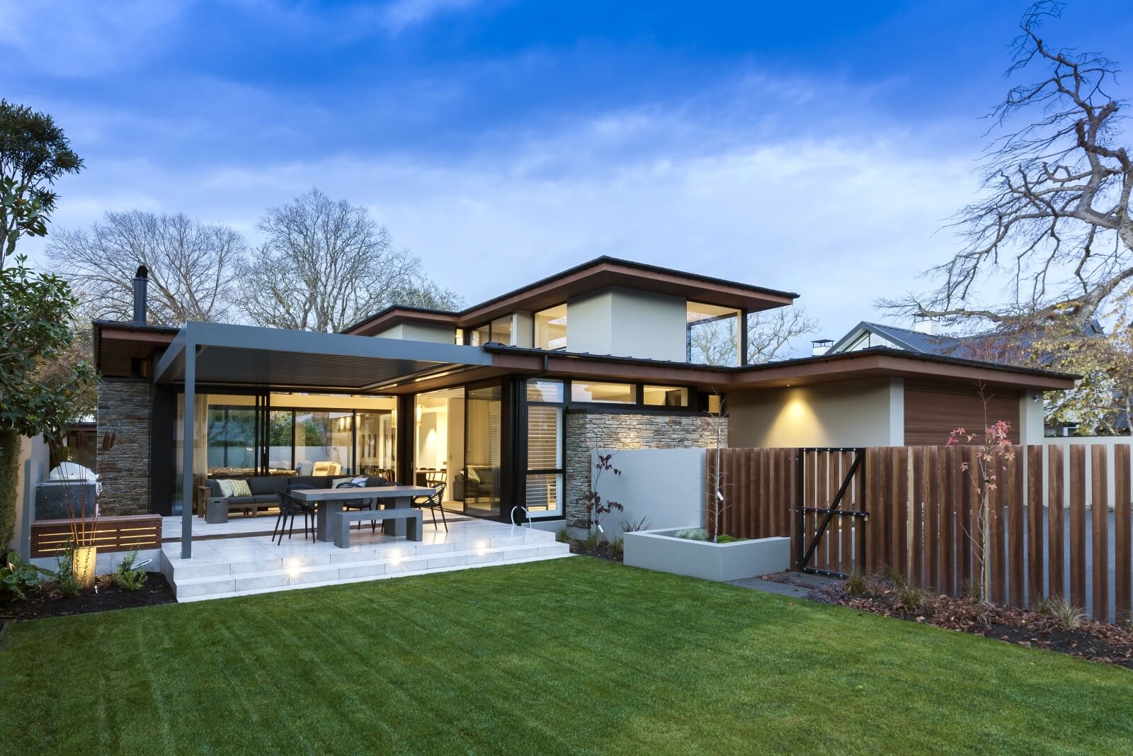
Mt Pleasant Pool House
Relaxation with a view
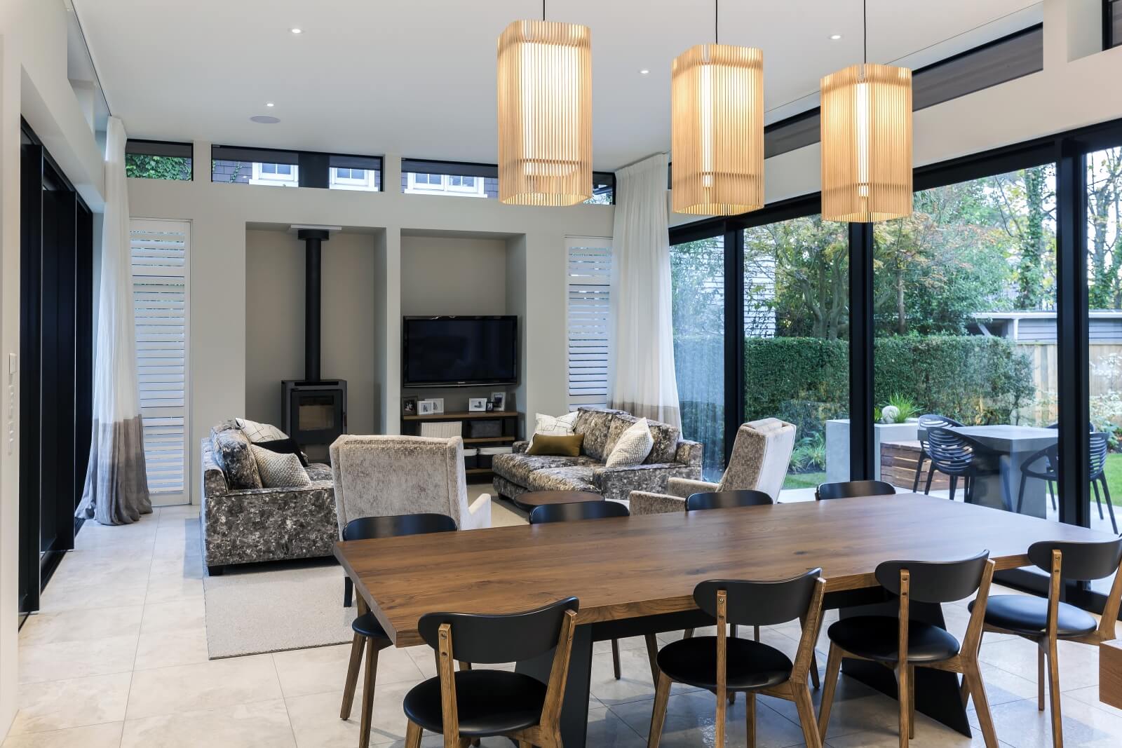
Light, Fresh, Flowing & Calming are the keywords of this small yet impactful project.
We’ve prioritised the natural light and expansive view by using lightweight curtain fabrics, minimising window coverage during the day with the flexibility of sheers for light filtering and control.
This evident connection to water and land is complemented by the existing architecture, so we’ve emphasised that indoor-outdoor flow through the layout and scale of furniture. The use of colour compliments the interior architecture with practical yet comfortable fabrics and furniture for all day relaxation in this beautiful space.
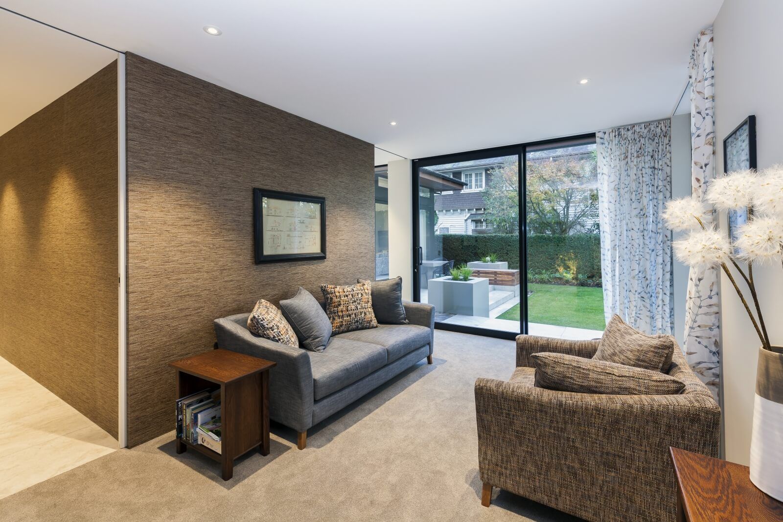
Resulting in a multi-use practical extra room of the home that encompasses thoughtful design.


South New Brighton Home
Easy Beachside Living
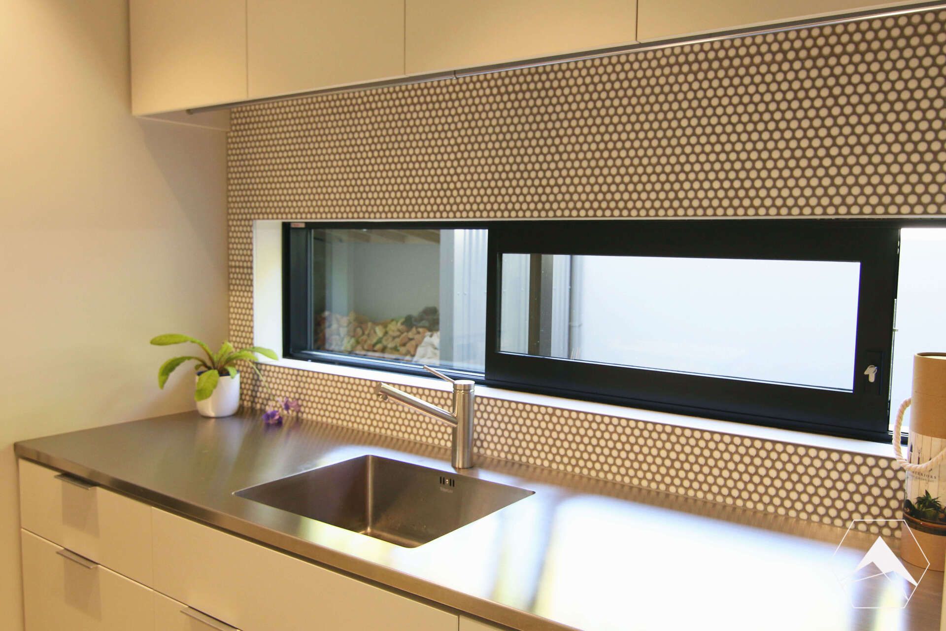
Starting off by helping with unsure kitchen renovation plans, we came aboard, listened and took a brief. Ending up with a confident overhaul on plans, designs, fittings and finishes to work with the clients lifestyle.
To fit the homes character we:
- Used timber veneer bench tops
- Rustic tiles & handles
- Neutral & warm colours
To add a personal touch:
- Open shelving
- Everything easy to reach
- Incorporating natural elements like plant shelves & utilised natural light
Modern elements for timeless usage
- LED lighting
- Soft close joinery
- Pull out oil & spice rack
- Pull out pot & pan corner
- Deep sink
We then got involved with re-vamping the other living areas. From re-covering the dining furniture & a passed down family day bed to a total makeover in the lounge & hallway:
- Interior paint and wallpaper colour scheme
- Slate installed over existing fire hearth
- Locally made bespoke chairs, cushions, curtains, rugs, a sofa, ottoman & TV unit.


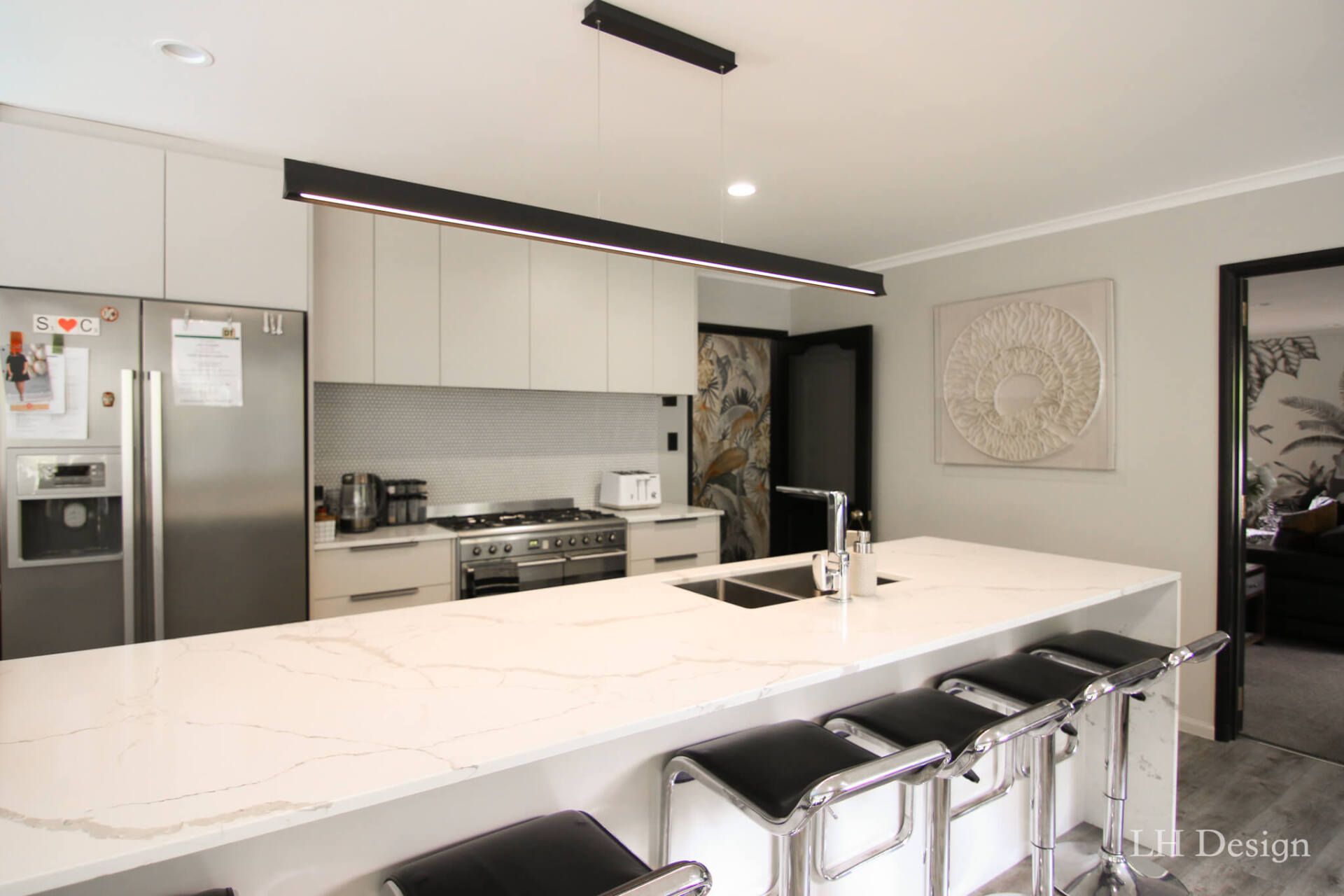
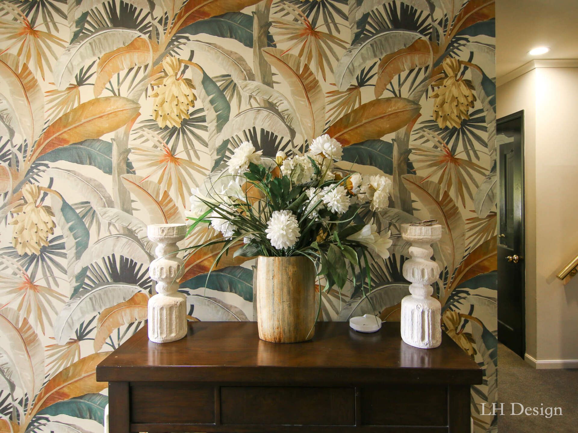
Merivale Home
We were lucky enough to be involved right from the beginning with this project. With decisions from flooring, bathrooms and joinery to the very last finishing touches such as wallpaper, cushions and artwork.
Our clients were apprehensive about a new build, having lived in their family character home for years and having to rebuild it came with challenges where they still wanted a home with a heart.
We worked closely with our clients to achieve an atmosphere which made their house feel like a home. We achieved this by:
- Using timber with warm tones
- Floating staircase in 17th Century French Oak from the Loire Valley
- Earthy stone features with warm tones
- Carrying rich coloured timber into kitchen to soften modern lines
- Textured loop rug in family area
- Soft sheer unlined curtains & shutters helped control light in sunny new home
- Inviting soft furnishings throughout the living areas
- Custom made soft and hard furniture to perfectly fit the layout of each room
- Timeless bathrooms with a neutral colour scheme
- Gorgeous feature pieces in each room to make it their own


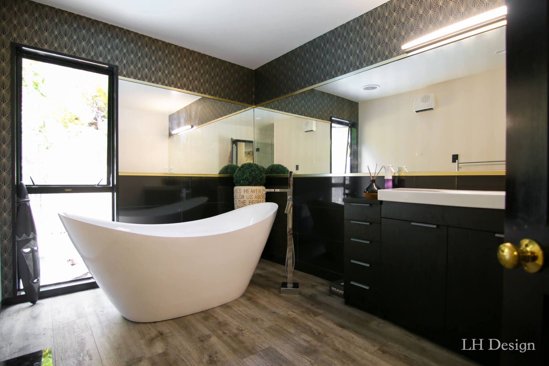
Hillsborough Home
This clients South African background has influenced their style. We have used their cultivated art and sculptural pieces to inspire a theme across their home. By choosing natural textures and timber for the base and adding animal print, rich warm tones and gold for the finishing details, has resulted in a fun and complementary scheme that enhances their personal style and feeling of home.
To maximise the spatial flow in the kitchen, meant relocating the kitchen to the other side of the room and putting in double sliding doors. This now better utilises the existing space, creating a simpler layout for indoor outdoor flow between a beautiful dining area and courtyard outside. A simple colour scheme is used where this family centred area can be busy which allows their art pieces and other aspects of the home to speak.
We have created a cohesive look for this home by completing:
- A full colour and wallpaper scheme throughout
- Spatial layout in living areas
- Specifying, making and fitting curtains and blinds
- Specifying and making soft furnishings including chairs and cushions
- Specifying and supplying surfaces and in the kitchen and bathrooms
- Selecting kitchen and bathroom flooring


Woodford House Project
A major Christchurch restoration project
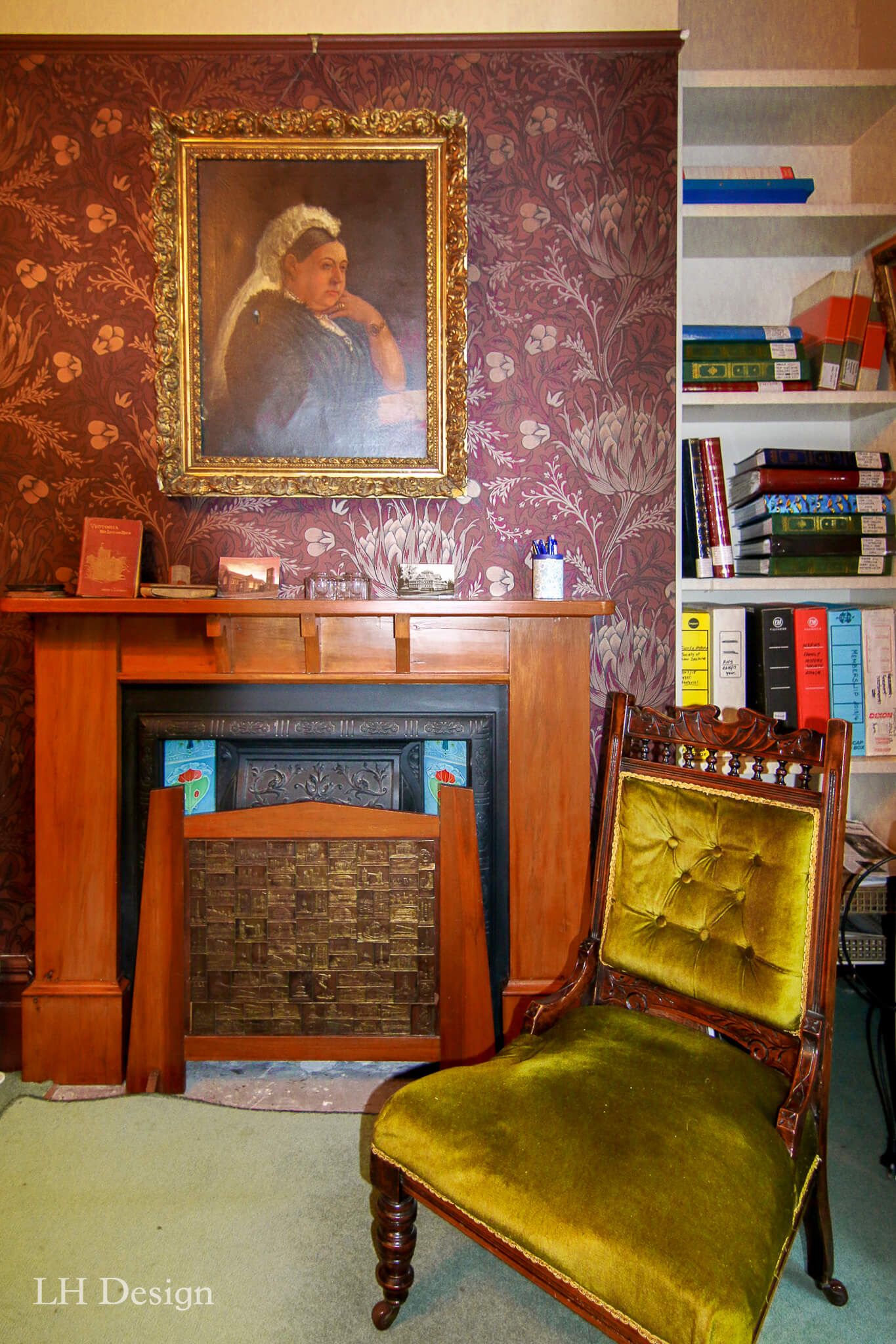
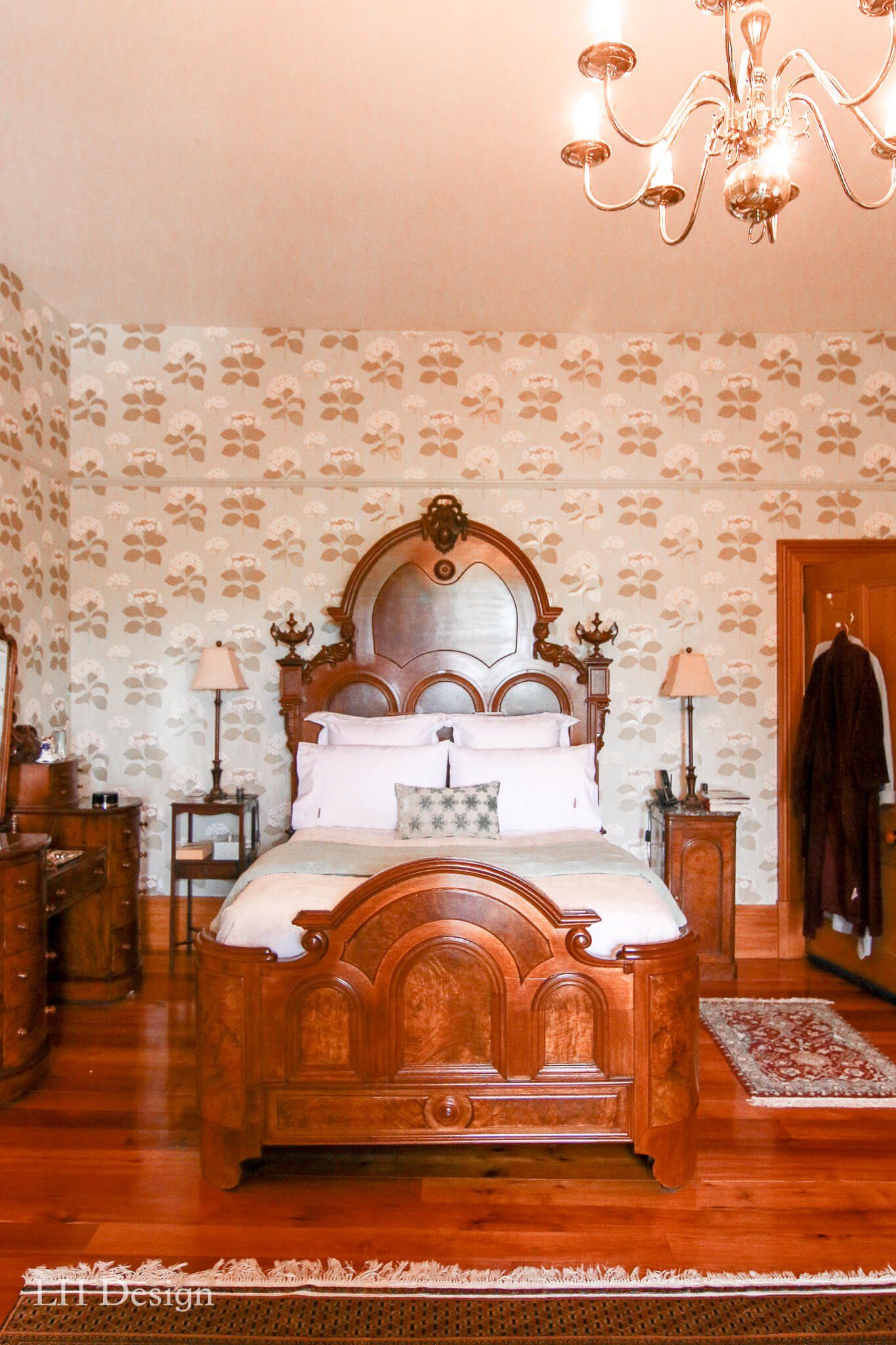
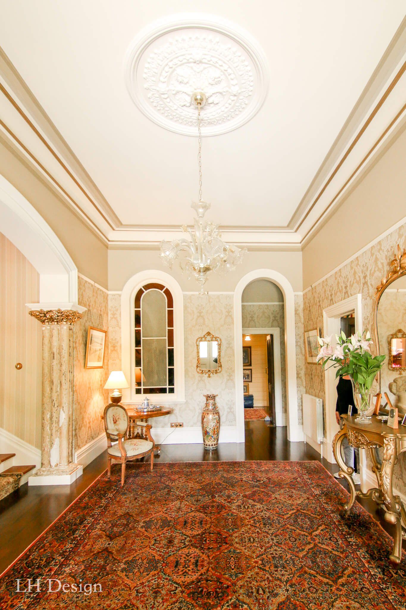
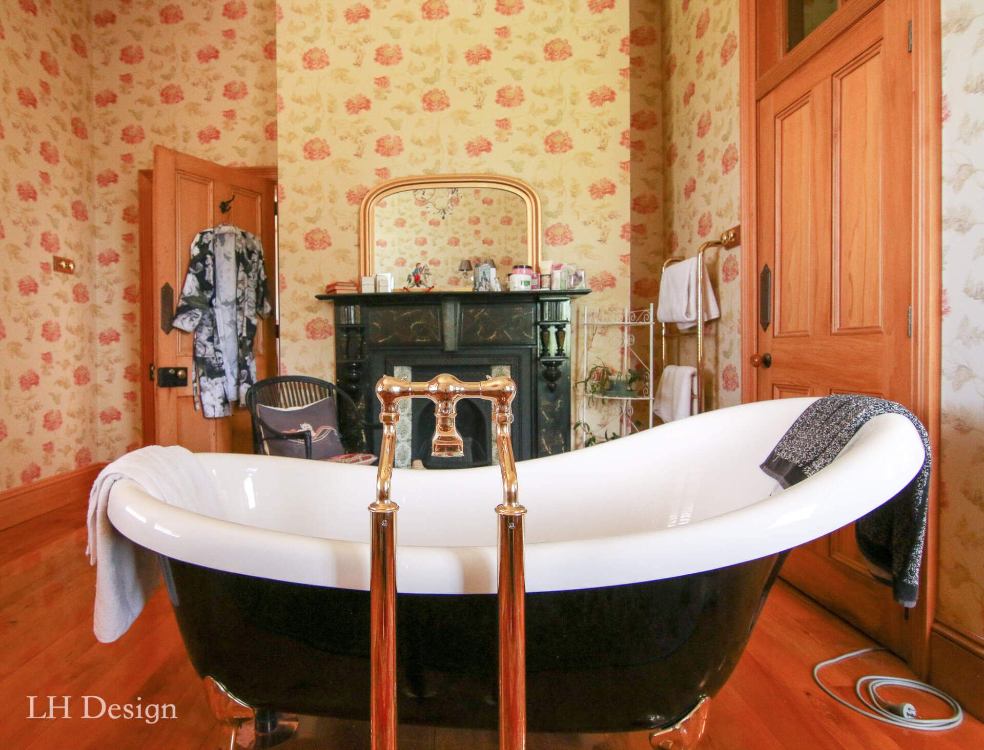
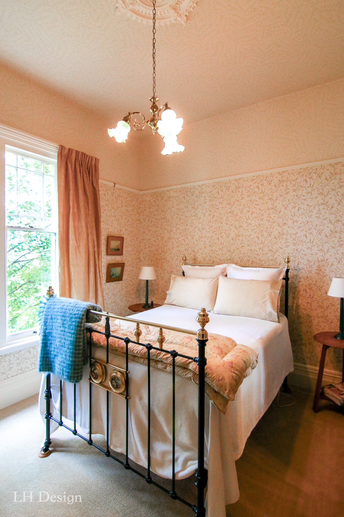
Woodford in Papanui is a grand heritage building. Built in 1887, this 27-room residence is a monument to Victorian architecture.
In 1983 bought by members of the New Zealand Historic Places Trust, Jill and Trevor have lovingly been restoring this Victorian home to its initial glory. The Canterbury earthquakes were a huge motivation to complete this project as many owners of heritage buildings decided the cost to restore was too great. Jill and Trevor have returned Woodford to its original layout and function of each room.
A tactile approach to interior design
Walking through Woodford today, you get a real sense of Victorian character and charm. We consulted on the overall design, including furniture, curtains, carpet and rugs, as well as paint colours and feature wallpaper in all 27 rooms, hallways and entrances. With all elements working together they create the atmosphere of a stately home from the 1880s.
While Jill and Trevor added to their antique collection, our LH Design team worked closely with our suppliers and importers to source fabrics and wallpaper to look cohesive with the architecture of this beautiful home being bought back to life.
Due to the scale of the windows the curtains needed to be thick and luxurious and also help retain heat in the home. Paint and textile colours had to be timeless to work with the natural Kauri finishes. But most of all everything that was carefully chosen had to meet the brief, to work together and feel like you were taking a step back in time.
As you can see in the photo’s the paint colour scheme is very detailed, with the ceiling roses, cornices, and trim work. A good example of this is the formal dining room. We made up colour boards to assist the painters with the combinations, alongside regular meetings with trades to ensure the outcome we were after was achieved.